
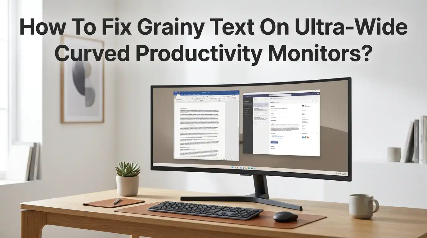
How To Fix Grainy Text On Ultra-Wide Curved Productivity Monitors?
Grainy text on an ultra-wide curved monitor can ruin your workday. You bought a premium display for sharper visuals and bigger workspaces. Instead, the letters look fuzzy, pixelated, or smeared across the screen.
This problem hits writers, coders, designers, and office workers the hardest. Reading documents for hours feels exhausting when every word looks soft around the edges. The good news is that grainy text is almost always fixable.
Most cases come from wrong settings, not faulty hardware. This guide walks you through every proven fix, from cable swaps to font smoothing tweaks. By the end, you will know exactly what to adjust, why it works, and which method suits your setup.
Key Takeaways
- Wrong resolution is the top cause. Always run your monitor at its native resolution, which is usually 3440×1440 or 5120×1440. Anything lower stretches pixels and creates grainy edges around letters.
- Cables and ports matter more than you think. A cheap HDMI cable or older DisplayPort version cannot carry the full signal. Switching to a certified DisplayPort 1.4 or HDMI 2.1 cable often fixes the issue instantly.
- ClearType and font smoothing tools sharpen text. Windows ships with a ClearType Text Tuner that calibrates text rendering for your specific panel type, whether VA, IPS, or OLED.
- DPI scaling fixes blurry apps fast. Setting scale to 125 percent or 150 percent in Windows display settings reduces eye strain and makes text crisper on dense ultra-wide panels.
- Color format affects sharpness. Using YCbCr 4:2:0 instead of RGB Full causes color fringing on text. Always select RGB Full in your GPU control panel.
- VA panels need extra tuning. Curved VA screens often need sharpness reduced and response time slowed down to stop text from smearing or shimmering.
Why Text Looks Grainy On Ultra-Wide Curved Monitors
Grainy text usually comes from a signal mismatch between your computer and your monitor. Your GPU sends one resolution, but the monitor expects another. This forces the screen to stretch or compress pixels, which makes letters look rough.
Curved panels also use VA technology in many cases. VA pixels have softer edges than IPS pixels, so text can look slightly fuzzy by default. The wider aspect ratio of 21:9 or 32:9 also spreads pixels across more horizontal space, lowering pixel density.
Older cables, wrong color settings, and Windows scaling bugs add to the problem. Once you understand these root causes, fixing them becomes simple and quick.
Check Your Native Resolution First
The first step is always to confirm your monitor runs at its native resolution. Ultra-wide curved monitors use unusual resolutions like 3440×1440, 3840×1600, or 5120×1440. If Windows picks 1920×1080 by default, text will look terrible.
Open Settings, click System, then Display. Scroll down to Display resolution and pick the highest value marked as Recommended. Save the change and check the difference right away.
Pros: This fix takes seconds, costs nothing, and solves most graininess problems immediately. Cons: Some older GPUs cannot push ultra-wide resolutions at high refresh rates. If your screen flickers after the change, lower the refresh rate slightly in advanced display settings.
Set The Correct DPI Scaling In Windows
Even at native resolution, text can look small or blurry on a 34 inch or 49 inch curved screen. Windows uses DPI scaling to make text and icons larger without changing resolution.
Go to Settings, then System, then Display. Find the Scale and layout dropdown. Try 125 percent first, then 150 percent if you sit further away. Pick the value that makes text easy to read without losing sharpness.
Pros: Scaling keeps your full workspace while making text readable. It also reduces eye strain during long sessions. Cons: Some older apps like Photoshop or AutoCAD do not handle scaling well and may still look fuzzy. You may need to override scaling per app using the compatibility tab in their shortcut properties.
Run The ClearType Text Tuner
Windows includes a built in tool called ClearType Text Tuner that calibrates subpixel rendering for your exact panel. Most users never run it, which is a mistake.
Press the Windows key and type ClearType. Click Adjust ClearType text. Make sure the box is checked, then click Next through five screens. Pick the text sample that looks sharpest each time.
The tool tunes how Windows uses red, green, and blue subpixels to draw smoother letters. Pros: It is free, takes two minutes, and works on every Windows 10 and 11 machine. Cons: The default ClearType setting is tuned for flat IPS panels. On curved VA monitors, the results sometimes still look slightly soft, so you may need to repeat the tuning a few times.
Use The Right Cable And Port
A weak cable causes signal loss, color banding, and grainy edges on text. Many ultra-wide monitors ship with basic HDMI cables that cannot carry the full bandwidth.
For 3440×1440 at 100Hz or higher, you need DisplayPort 1.2 or newer. For 5120×1440 at 120Hz or 4K ultra-wide, use DisplayPort 1.4 or HDMI 2.1 certified cables.
Plug your cable directly into the GPU, never into the motherboard port unless you use integrated graphics. Avoid USB-C to HDMI adapters when possible. Pros: A certified cable is cheap and instantly improves text clarity. Cons: Buying the wrong cable wastes money. Always check your monitor manual for the recommended cable spec before shopping.
Switch The Color Format To RGB Full
Many GPUs default to YCbCr 4:2:0 or Limited RGB when connected over HDMI. These formats compress color data, which makes text edges look red, green, or fuzzy.
For NVIDIA users, open NVIDIA Control Panel, click Change resolution, scroll down to Output color format, and pick RGB. Set Output dynamic range to Full.
For AMD users, open AMD Software, go to Display, and switch Pixel Format to RGB 4:4:4 Pixel Format PC Standard (Full RGB). Pros: This single change can transform text quality, especially on curved VA panels. Cons: Some older HDMI cables cannot handle Full RGB at high refresh rates and may cause black screen flickers, so you might need to lower the refresh rate slightly.
Adjust Sharpness On The Monitor Itself
Most curved monitors include a Sharpness setting in their on screen menu. Many ship with sharpness set too high, which adds artificial halos around letters. Others set it too low, making text look soft.
Press the menu button on your monitor and find Picture or Image settings. Look for Sharpness and set it to the middle value, often 50 or 5 depending on the brand. Adjust up or down by small steps.
Pros: This setting works on every operating system and does not need software. Cons: Sharpness is a cosmetic filter, not a real fix. Setting it too high creates fake edges that look worse than soft text. Always start at the factory default before tweaking.
Disable Overdrive Or Response Time Boost
Curved VA monitors often include an Overdrive or Response Time setting. Set too high, this feature creates inverse ghosting, where bright trails appear behind moving text when you scroll.
Open your monitor menu and look for Response Time, Overdrive, or MPRT. Set it to Normal or Standard, not Fastest or Extreme.
Pros: This fix removes the smeary look around scrolling text in browsers, Word, and code editors. It also prevents eye fatigue during long reading sessions. Cons: Lower overdrive means slightly slower pixel transitions during fast gaming. For productivity work, this trade off is worth it. VA panels especially benefit because their pixels respond slower than IPS by nature.
Update Your Graphics Drivers
Old GPU drivers can mishandle ultra-wide resolutions, refresh rates, and HDR output. This often shows up as grainy text after a Windows update or a new monitor install.
For NVIDIA, download the latest Game Ready or Studio Driver from the NVIDIA website. For AMD, get the newest Adrenalin driver. For Intel Arc, use the Intel Graphics Software app.
Always pick the clean install option during setup. This removes leftover files that may cause conflicts. Pros: Fresh drivers add support for new monitors, fix scaling bugs, and improve text clarity in many cases. Cons: Brand new drivers sometimes ship with their own bugs. If text looks worse after an update, roll back to the previous version using Device Manager.
Tweak Font Smoothing With MacType Or Better ClearType
If built in ClearType still does not make text crisp enough, try a third party font renderer. MacType is a popular free tool that replaces Windows font smoothing with a smoother engine similar to macOS.
Download MacType from its official GitHub page. Install it, run the MacType Wizard, and pick a profile like Default or LCD. Restart your apps and check the difference.
Pros: MacType makes text look sharper and softer at the same time, which is great on OLED and VA curved panels. Many ultra-wide users on Reddit swear by it. Cons: MacType is unofficial and may flag as suspicious in some antivirus tools. It can also cause minor glitches in certain apps, so test it carefully before relying on it daily.
Fix Browser And App Specific Blur
Sometimes only browsers or specific apps look grainy. This usually points to a per app scaling issue, not a system wide problem.
In Chrome or Edge, type chrome://flags in the address bar, search for force color profile, and set it to sRGB. Restart the browser. Also check Settings, Appearance, and adjust Page zoom to 110 percent or 125 percent.
For desktop apps, right click the shortcut, click Properties, go to Compatibility, click Change high DPI settings, and tick Override high DPI scaling behavior. Set it to System (Enhanced). Pros: This targeted fix solves blur in legacy apps like older Office versions. Cons: You must repeat this for each problem app, which takes time.
Check For HDR And Color Profile Conflicts
HDR mode on ultra-wide monitors can wash out text and make it look grainy or faded. Many productivity panels handle HDR poorly compared to TVs.
Open Settings, click System, then Display, and toggle Use HDR off for daily desktop work. Only turn it on for movies or HDR games.
Also check your color profile. Go to Color Management in Windows search, pick your monitor, and set the default profile to sRGB IEC61966-2.1. Pros: Disabling HDR and using sRGB gives you consistent, sharp text across every app. Cons: You lose HDR brightness for media. A quick workaround is creating two display profiles and switching them with a hotkey app like AutoHotkey.
When To Suspect A Hardware Defect
If you have tried every software fix and text still looks grainy, the monitor itself may have a defect. Common hardware issues include dead subpixels, panel uniformity problems, or factory miscalibration.
Test the monitor on a second computer or laptop. If grainy text follows the monitor across devices, the panel is likely faulty. Run a dead pixel test using free websites like deadpixeltest.org.
Pros: Identifying a hardware fault early lets you claim warranty replacement before the return window closes. Cons: Returns and exchanges take time and may leave you without a monitor for days. Always keep the original box and receipt for at least the first 30 days.
Final Tips For Long Term Sharp Text
A few habits keep your ultra-wide curved monitor looking crisp for years. Clean the screen weekly with a microfiber cloth and distilled water. Dust and smudges scatter light and make text look hazy.
Keep the monitor at arm’s length, about 60 to 80 centimeters from your eyes. Sitting too close on a curved screen creates focal distortion at the edges, which feels like graininess.
Recalibrate ClearType every six months and after every major Windows update. Pros: These habits cost nothing and protect your investment. Cons: They take a few minutes of upkeep, but the payoff in eye comfort and productivity is huge over years of daily use.
FAQs
Why does my ultra-wide curved monitor look grainier than my old flat monitor?
Curved monitors often use VA panels, which have softer subpixel edges than IPS. They also spread pixels across a wider area, lowering pixel density. Both factors make text look slightly grainier until you tune ClearType, scaling, and color format correctly.
Is 1440p enough for sharp text on a 34 inch ultra-wide?
Yes, 3440×1440 gives roughly 110 pixels per inch on a 34 inch ultra-wide, which is sharp enough for office work. If you want noticeably crisper text, look at 5120×1440 or 3840×1600 panels with higher pixel density.
Does ClearType work on OLED ultra-wide monitors?
ClearType is built for RGB subpixel layouts, but many OLED panels use WRGB or pentile layouts. This can make text fringe on OLED. Tools like MacType or the new Windows 11 grayscale text rendering option often work better on OLED.
Should I use HDMI or DisplayPort for sharp text?
DisplayPort is almost always better for productivity. It supports higher bandwidth, Full RGB color, and adaptive sync more reliably than HDMI. Use HDMI 2.1 only if your GPU lacks enough DisplayPort outputs.
Why does text look blurry only in some apps after I changed scaling?
Older apps do not support per monitor DPI scaling. Windows stretches them like a low-res image, which causes blur. Right click the app, open Properties, go to Compatibility, and override high DPI behavior to System (Enhanced) to fix this.

Hi, I’m Pearl Standen, the voice behind The Web Utility. I’m a passionate tech enthusiast who loves exploring the latest gadgets, smart devices, and electronics that make everyday life easier. Through my website, I share honest, well-researched reviews of trending Amazon products to help you make smarter buying decisions.